Kevin Davis
Email · Resume · vCard
Award-winning Interactive and Graphic Designer. Collaborative experience with non-profits, corporate, and higher ed.
Work Includes: interactive features, dynamic websites & applications, brand & identity, composition, illustration, typography, and information architecture.
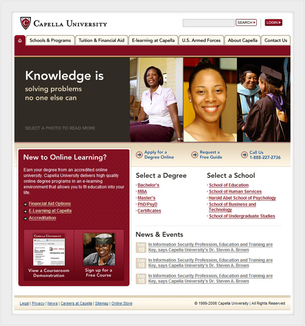
Capella University Homepage
During my time at Capella, I took part in the redesign of the homepage, the employee portal, learner portal, and email campaigns.
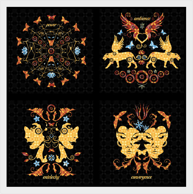
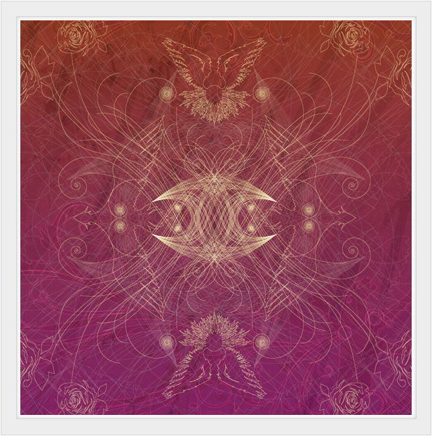
Ornamentals
A set of four, square compositions to convey new thinking in pattern and symbolism.
Red Dog Writers Group
Logotype based upon the typeface Museo. Contains many modifications with some custom lettering.
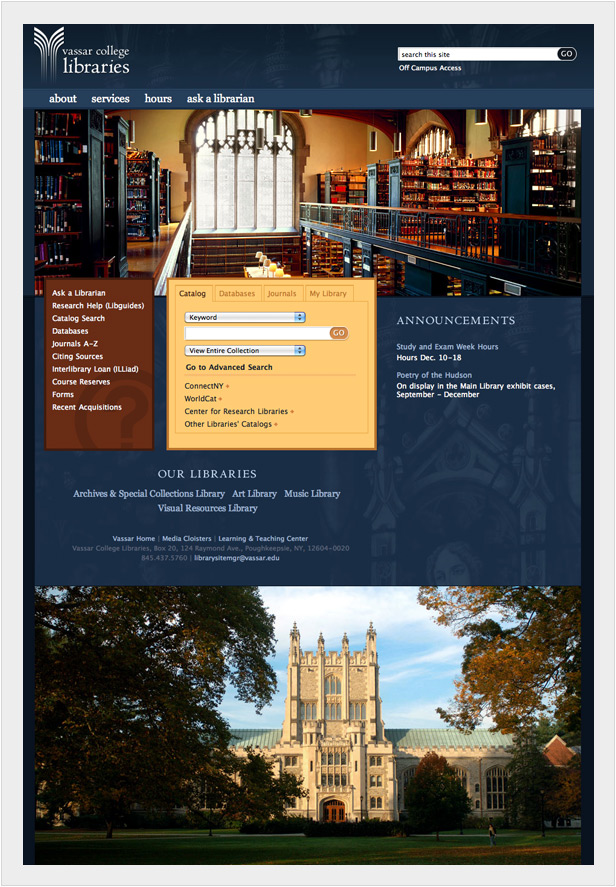
Vassar College Libraries
Incorporates expanded search, and visual direction for library materials.
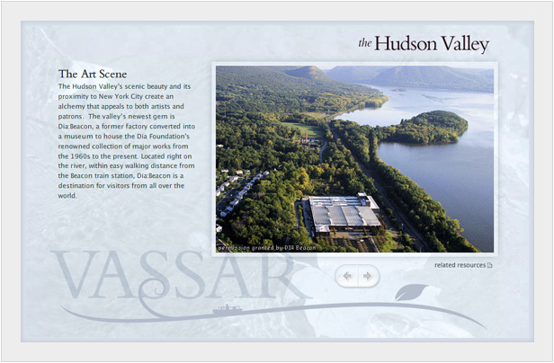
Hudson Valley Feature
A simple flash-based slideshow that also incorporates a pane for displaying related items.
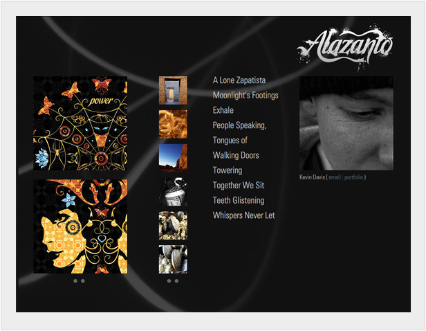
Alazanto v5
The latest iteration of my homepage is flash-based and focused on simplicity. Ties directly to flickr for images and an XML feed for the latest poetry.
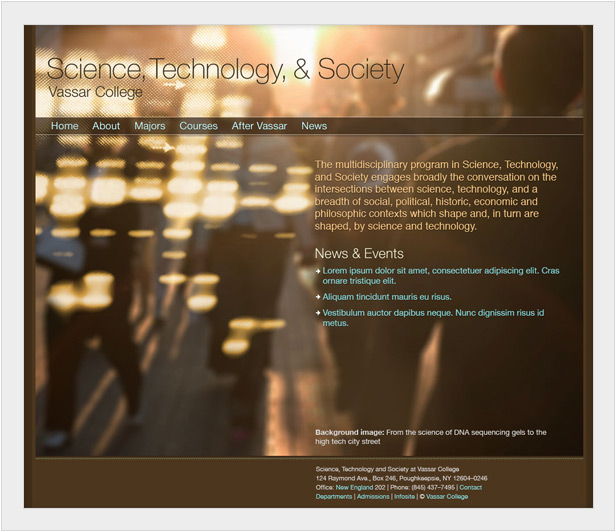
Science, Technology, & Society
Academic program at Vassar that contains a photo collage to represent the intersect between society and technology.
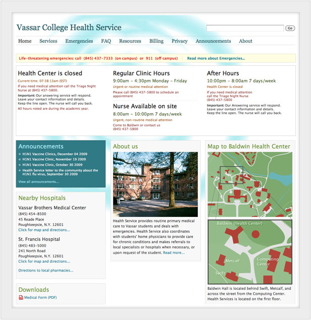
Health Services
This site was meant to provide information clearly and simply to anyone with a health concern or emergency.
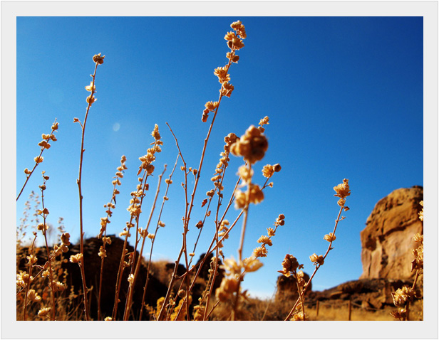
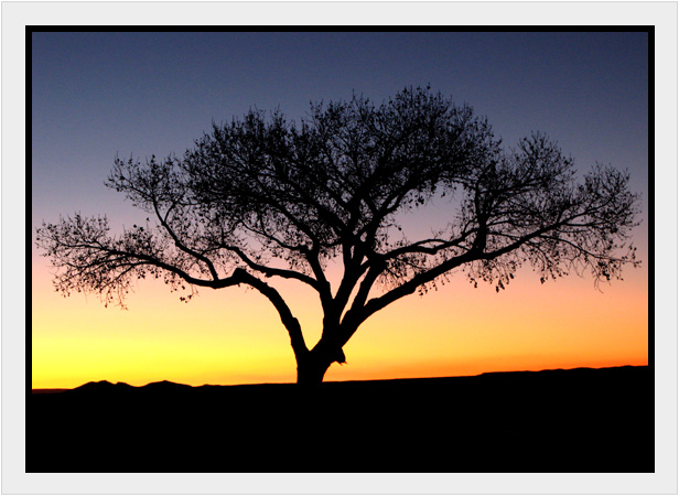
Chaco Canyon
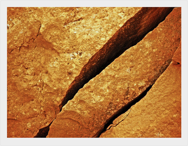
Chaco is beautiful in both the fall and spring, but be sure not to stay after sunset.
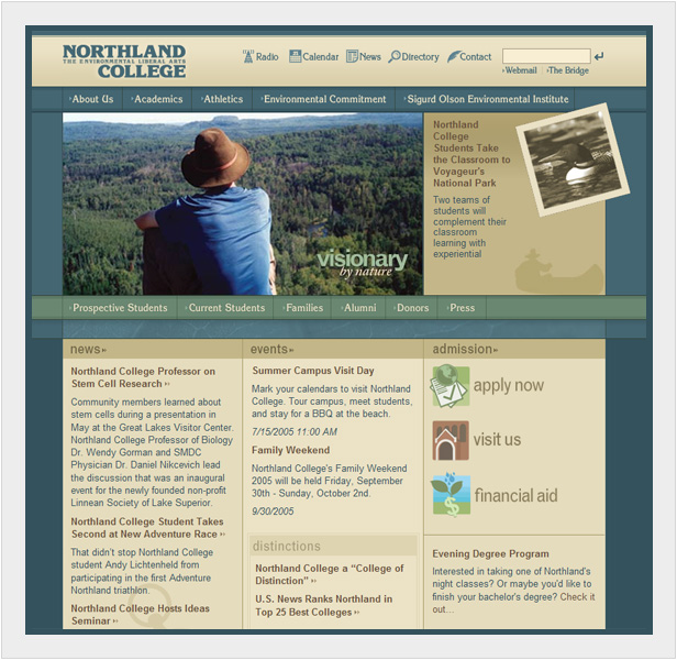
Northland College Homepage
My time at Northland was spent making extensive changes to the web presence. I deployed a content management system while re-designing and rebuilding the website.
Now, not only could staff update their own content, but the site now had a consistent visual identity moving forward.
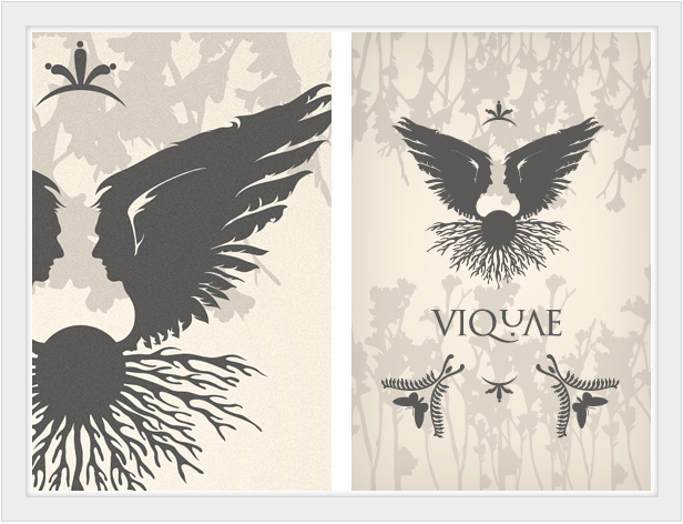
Viquae Poster
Sandbox project that incorporates a custom mark. The wings, faces, reflection, and roots are represenative of the creative mind.
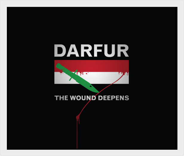
Save Darfur Poster
A simple play on the Sudanese flag to bring greater attention towards the ongoing Darfur situation.
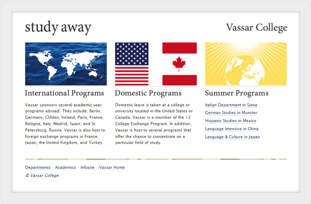
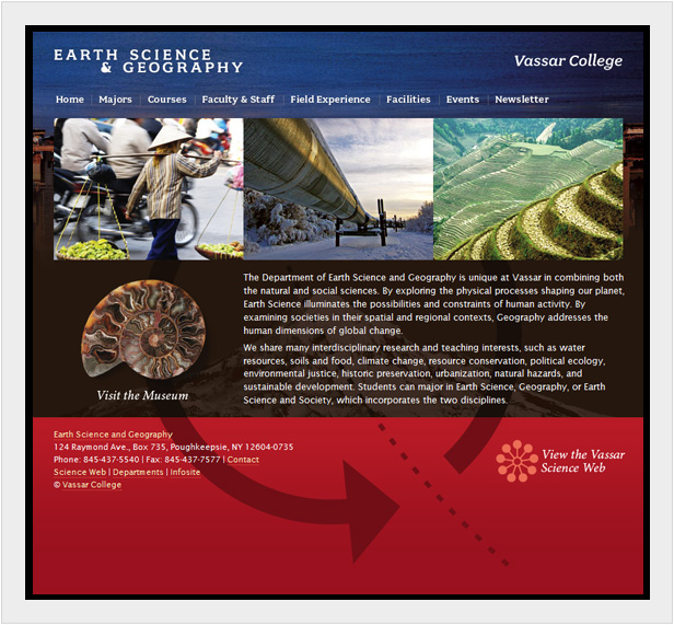
Vassar Earth Science and Geography
I managed to bring more visual play into this small site than is the norm for the audience. While more visually risky, the composition is also more memorable.
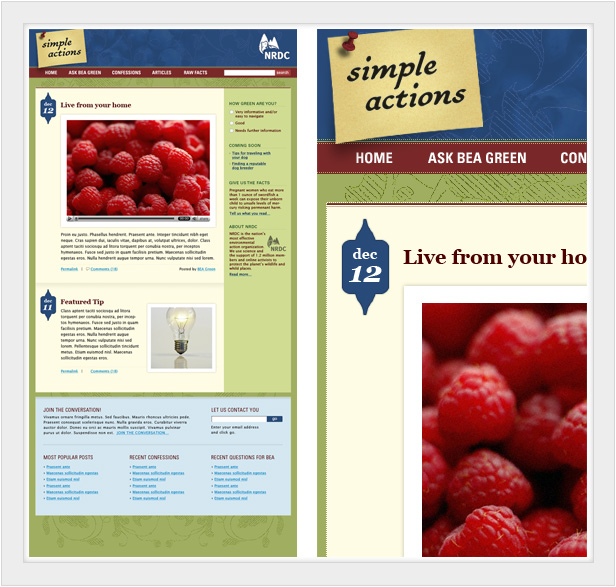
Simple Actions Blog
A concept-blog for the Natural Resources Defence Council. Even though this did not make it into production, it was a well recieved concept for the NRDC's new web strategy.
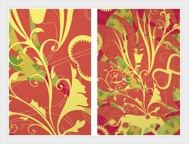
Ornamentals
Another sandbox project incorporated fine lines and a generally unfinished look.
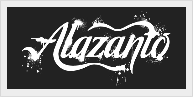
Alazanto Wordmark
Close-up of the Alazanto wordmark. Set in Malbeck and heavily modified.
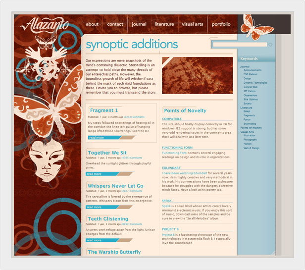
Alazanto v4
While I was happy to move on from this design, the visual direction showed my new thinking on design and my revived interest in vector forms.
Color-minimal Icon Study
I created this years ago as a Mozilla Firefox and Thunderbird theme. I love GUI work, and this was a wonderful opportunity to apply my own thinking to application interfaces.
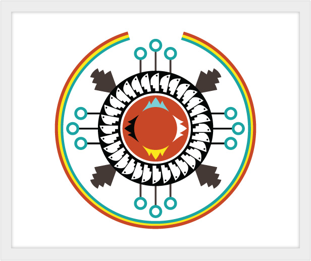
Navajo Mark Study
This was an opportunity to work with Navajo symbolism to convey education in the digital age.
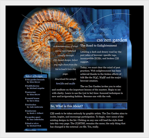
Zen Garden
This early Zen Garden design has recieved a great deal of recognition in its time. Many thanks to Dave Shay for accepting it into the family.
Be sure to email me if you have any questions!